Turn data into colours
Contents
Turn data into colours
You will often find yourself needing to display fields of values. One of the things you can do is make a sequence of colours and couple it to the data values so each data value maps to a colour in the sequence. The idea is simple. Let’s say you have a grid of the density of a formation over an area. The values range from 2.1 to 2.6, you set up a colour sequence (for example going from black to white), couple black to 2.1 and white to 2.6 and all values in between get an interpolated colour (a grey in this case). The traditional ‘variable density display’. Done.
But of course that’s not enough. You want fancy colour trajectories like along the rainbow or schemes that highlight a certain part of the range. Sometimes schemes are backed by colour theory (look up ‘Viridis’). You’ll find that different types of problems call for different colour sequences. So, you pull up a nice list of colour sequences to choose from.
But of course you can do better. Outliers in the data will have a big impact on automatically determined scale ranges, with the net effect that many colours of the sequence are hardly used. Only part of the selected sequence delivers details in the bulk of the data. To counter this, you allow setting the range manually. And to set a good initial range automatically, you implement clipping. Basically, you disregard the top and bottom so-may percents of the data values. Those values will then get the outer colours of the sequence.Things look bright, you make pretty pictures. The design is straightforward: the relative position in the value range is also the relative position in the colour sequence. Done.
But of course you want more. Some data types are commonly plotted reverse. For example, an altitude usually has bright colours for highs, dark colours for lows. But what if the values are depths? So you make it possible to use the sequence reverted. You’d also want to properly plot angles and other cyclic things. Like the dip direction of a certain layer, or phases. If you plot this in the normal way, going from just above 0 to just below 360 degrees will make the full jump. So, you make a way to use the sequence to end halfway and go back to the start colour, effectively doubling the sequence. This doubling actually reveals a lot more detail in many other types of data (hooray!). Oh and why not be able to revert AND double the sequence?
But of course you realize there’s even more. What you’ve just done is to make a more complex mapping of data value -> relative position in (clipped) range -> relative position in the colour sequence. You realise that generalising this would open yet other possibilities. For example, a nice byproduct of the calculations can be a histogram display. When you look at those pictures, you notice that a large part of the colours from the sequences is in the parts of the histogram where there is not a lot of data. Upon research, you discover ‘Histogram Equalisation’ - which basically makes the mapping such that all colours in the sequence are used in the same amount. Remember a histogram is just a plot type showing how the data is distributed. By using the cumulative distribution value as the relative position (rather than the position in the scale range) you can make a lot of displays much better.
To do all this right you will have objects for the colour sequence, the data, the mapping, and the distribution. They interact to provide a wide range of display possibilities that geoscientists need to have at their fingertips to get insight in the nature of the data. Because, well, there is no single best display.
And of course there’s more yet. There’s always more. Take colour blending. Make spectacular displays by combining different value fields into one output colour. And if you think you’ve got it all - well, then it’s time to invent your own things …
Figure
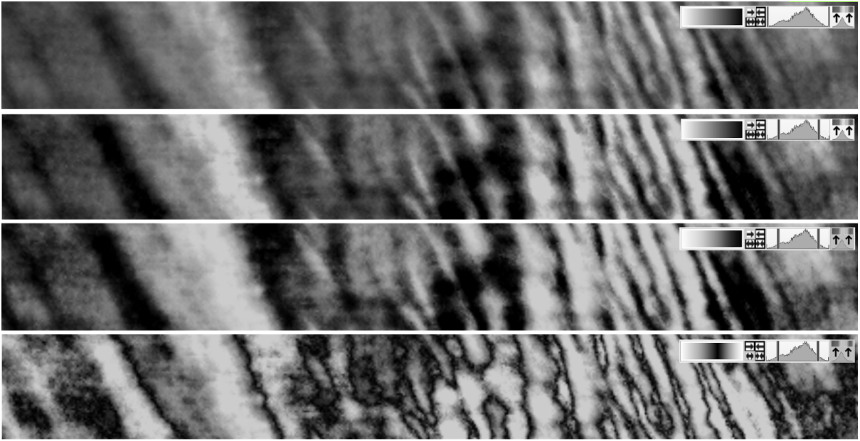
Top to bottom adding 5% clipping, histogram equalisation, doubling. Note that grey scales are shown because there’s no colour in the ‘52 things’.